
Before you start picking colors, it’s essential to have a clear plan. Your cabinet color isn’t just about decoration—it sets the tone for your entire kitchen’s atmosphere, space, and functionality.
Cabinets Are the Centerpiece: Cabinets take up most of your kitchen’s visual space, so their color is key to defining the overall style. I recommend choosing your cabinet color first, then coordinating it with your walls, floors, and countertops.
Space and Light Are Key:
For small or dimly lit kitchens: Choose lighter colors (like white, light gray, or cream). They reflect light, making the space feel more open and airy.
For large or well-lit kitchens: You have the freedom to go with darker or more saturated colors (like navy blue, emerald green, or matte black) to add depth and a touch of drama.
Prioritize Quality and Functionality: While color is important, don’t sacrifice practicality. High-quality materials, durable hardware, and smart storage solutions are what truly make a kitchen last.
Here are some timeless classics and current trends to help you find the perfect match for your home.
These colors are versatile and won’t go out of style, giving you a flexible foundation for your kitchen.
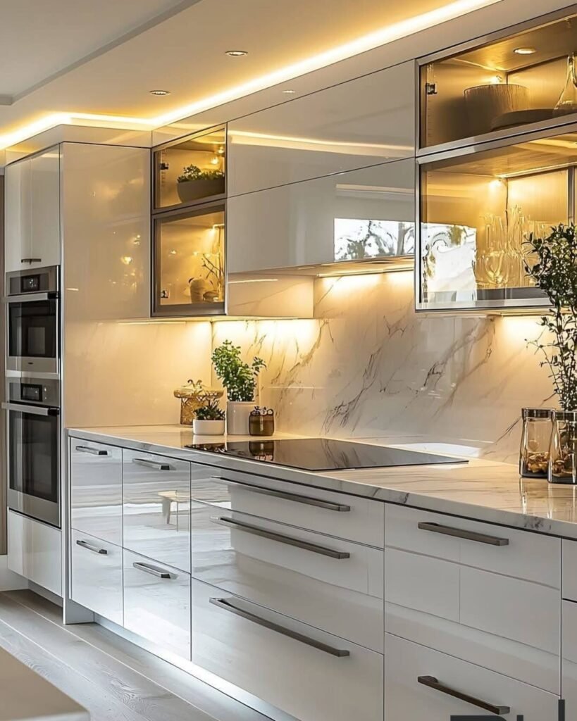
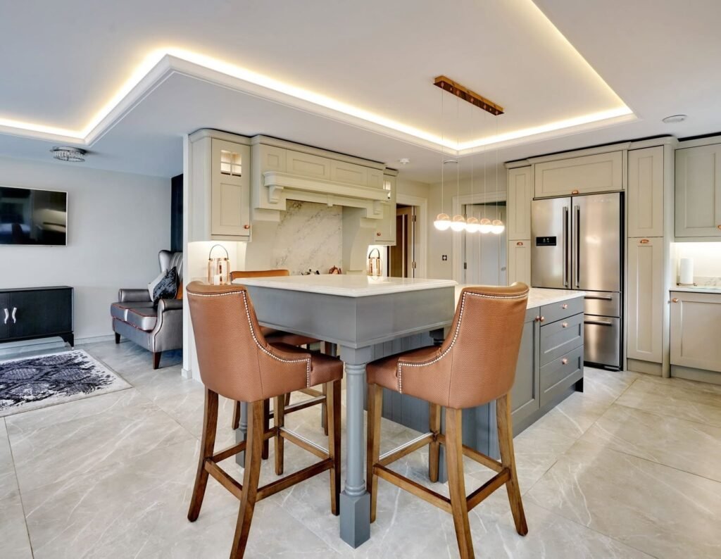
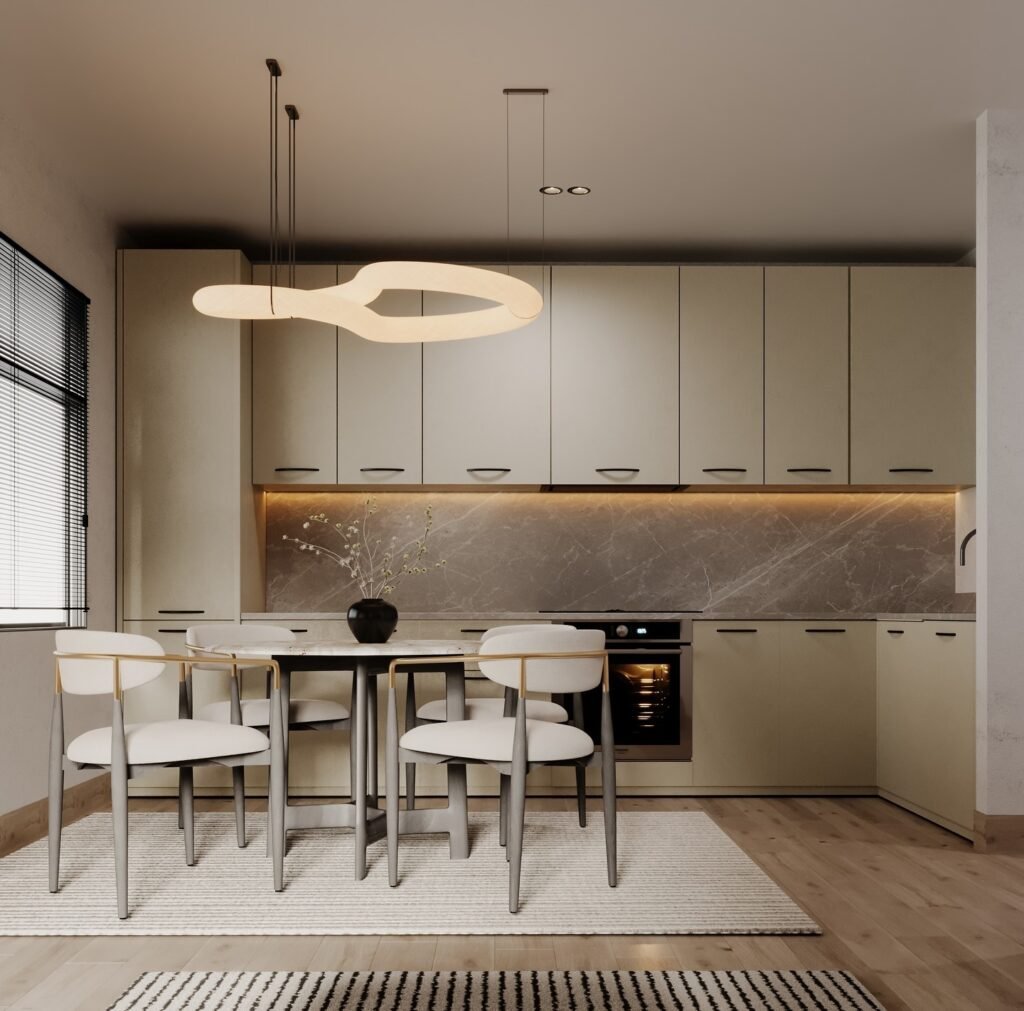
White Tones: This includes pure white, cream, and off-white. It’s the top choice for a clean, bright, and minimalist look. Creamier whites add a hint of warmth and a vintage feel, perfect for a cozy kitchen.
Gray Tones: From light gray to charcoal, gray strikes a balance between modern and sophisticated. Light gray is soft and versatile, while darker gray offers a more dramatic, refined aesthetic.
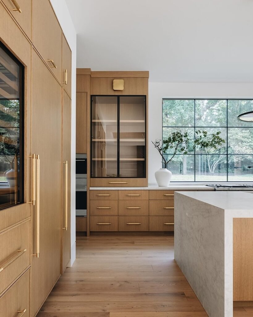
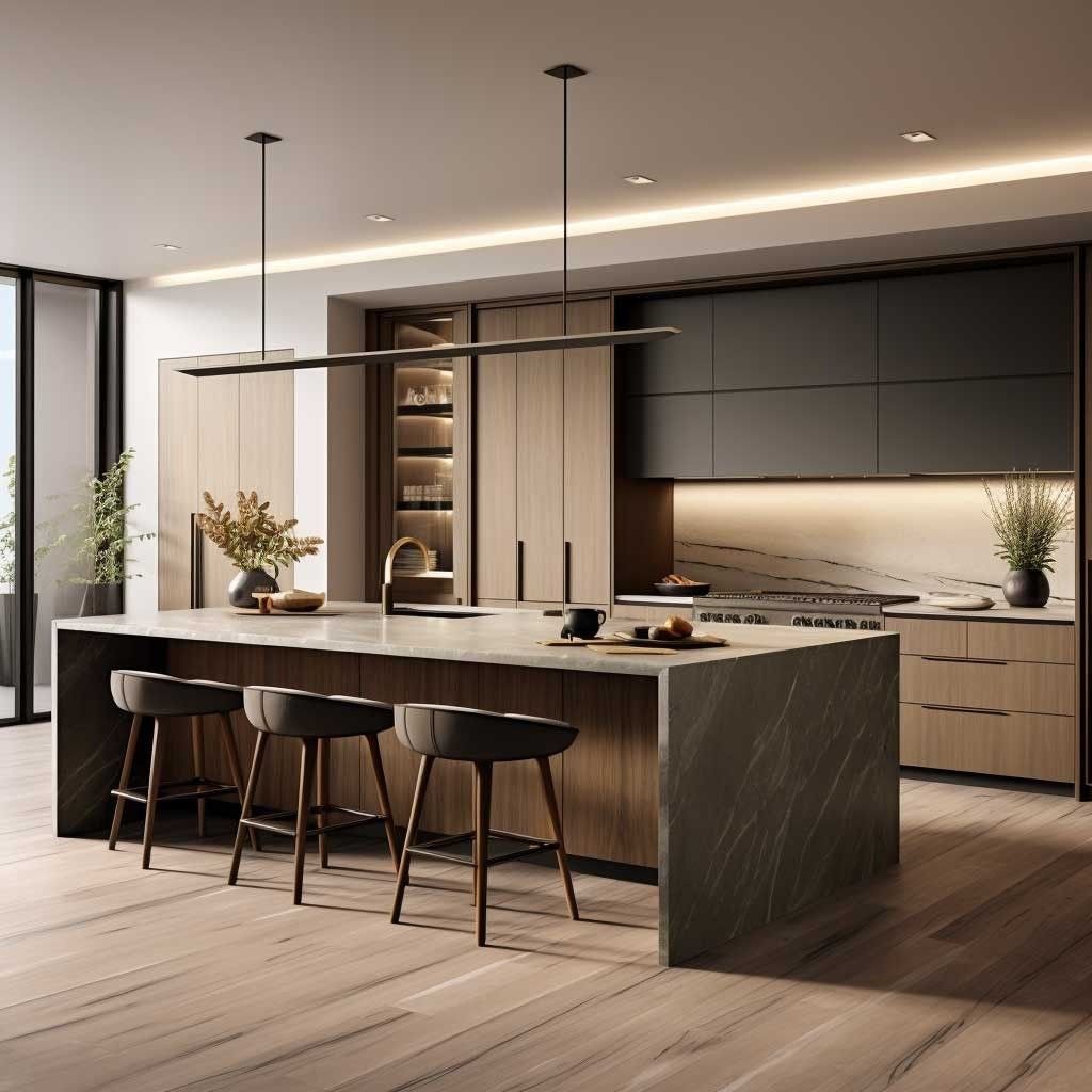
Wood Tones: Natural wood grain, whether oak or walnut, brings a sense of warmth and nature into the home. It’s a signature look for Japanese-style, Scandinavian, and rustic kitchens, creating a warm, inviting atmosphere.
If you want your kitchen to stand out, consider these popular and stylish options.
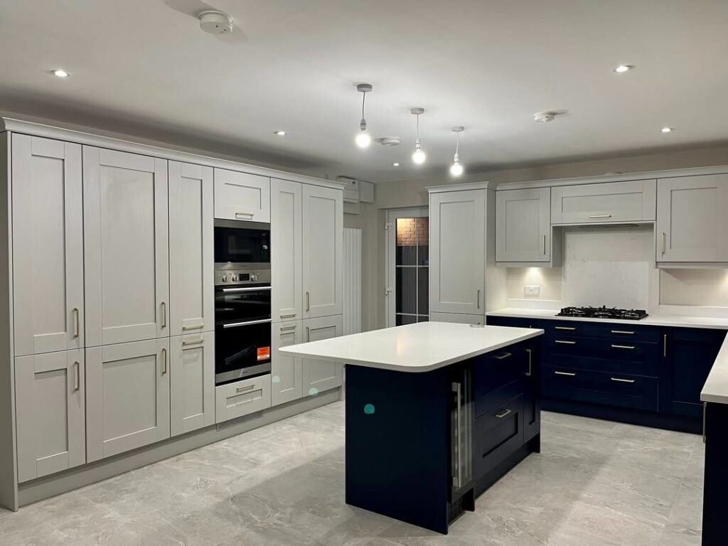
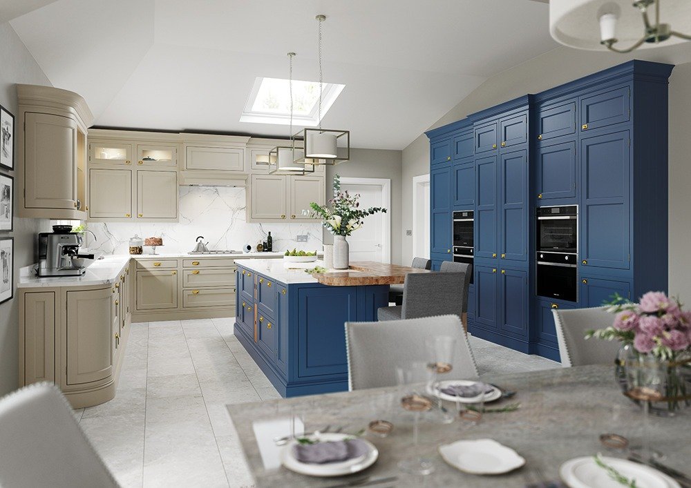
Blue Tones: From muted sky blue to deep navy, blue cabinets can create a calm or luxurious feel. They pair beautifully with white countertops and brass hardware.
Green Tones: Colors like sage green, forest green, and hunter green bring a fresh, natural vibe. They can create a minimalist, fresh, or retro feel, and look great with wood and metal accents.
Black Tones: Matte black and charcoal are bold and modern, making a powerful statement. They work best in larger spaces with ample lighting to prevent the room from feeling too dark.
This is a very popular design approach that allows you to have a unique yet timeless kitchen.
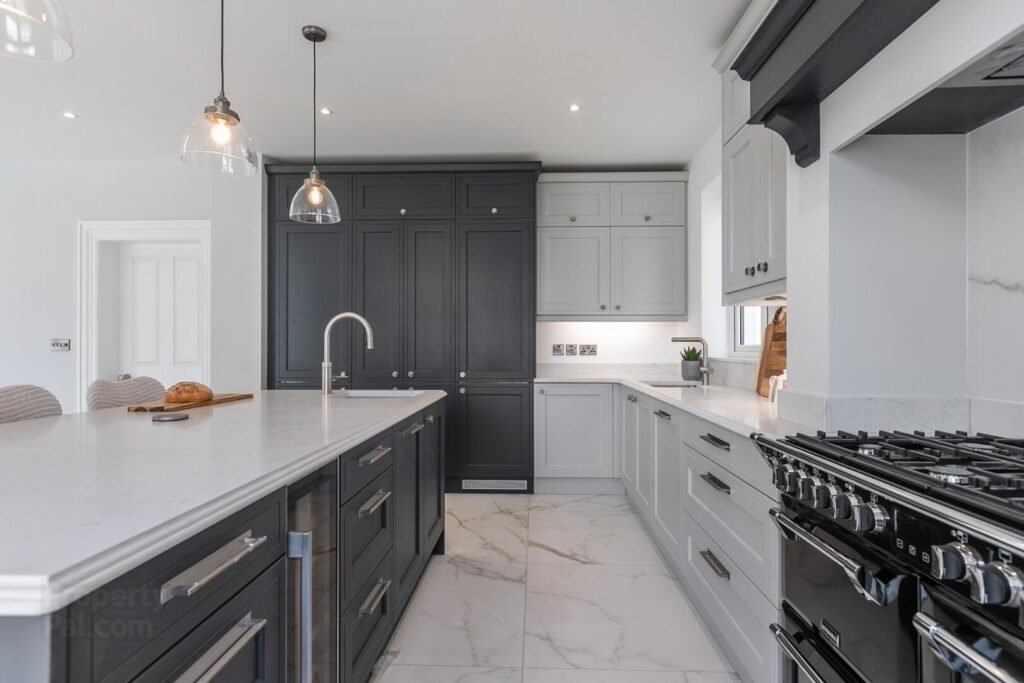
Light on Top, Dark on Bottom: This is the most common and safest combination. Choose white or light gray for the upper cabinets, and a darker color (like navy or dark green) for the lower cabinets. This prevents the space from feeling top-heavy while adding visual interest.
Use Bold Colors as Accents: If you love a trendy color but worry it might go out of style, use it on a kitchen island, a small accent cabinet, or the lower cabinets only. This way, it adds a pop of personality without overwhelming the space, and is easier to change later on.
Once you have a color in mind, here are a few more details to help you make the perfect choice.
Material Matters: The cabinet material affects how the color looks and feels.
Laminate/PET: Affordable and ideal for a modern, minimalist look.
Thermofoil/Lacquer: Can be molded into various shapes, perfect for European, French, or American styles, but can be more expensive.
Wood Veneer: Provides a natural, high-end feel, but also comes with a higher price tag.
Color and Psychology: Beyond aesthetics, consider how colors affect your mood and appetite. Bright, warm colors (like yellow) can be invigorating, while cool colors (like blue and green) can be calming and refreshing.
Final Checks:Before buying, always look at a color sample in your kitchen under different lighting conditions throughout the day.
Choose high-quality paint designed specifically for cabinets for better durability.Keep your cabinets looking their best with regular, gentle cleaning.
Choosing your cabinet color is a major decision, but by following these simple principles, you can create a kitchen that is both beautiful and practical for years to come. #newhomebuilders #kitchendesign #customkitchencabinet#kitchencabinetry#customkitchen
Hangzhou DecorVista Cabinet
86-158-6813-1904
decorvistacabinet@gmail.com
Floor 2, Block 3,No.589 Shixiang Road, Gongshu district, Hangzhou City, Zhejiang Province, China